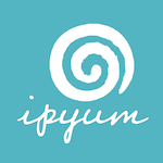
Logo update!


< Our final updated logo!
We’re excited to share ipyum’s new logo! This has been in the works for a while, and it finally feels right.
Carl, ipyum’s co-owner, does all our artwork himself. His original logo was a solid first attempt, but we always knew it could evolve. A while back, we started experimenting — printing T-shirts with a more relaxed font: the swirl on the front, ipyum on the back. We liked the look but hadn’t committed to a full redesign.
Then, last night, it clicked. Carl had a creative breakthrough and brought the pieces together into a new design that feels both fresh and cohesive. The swirl and the name now work in harmony — the new slanted, cursive font adds character and movement, while a higher-contrast color scheme improves readability.
We even ran the design through an AI-powered logo scoring tool and were pleasantly surprised:
100 for uniqueness
100 for legibility
69 for contrast
Overall score: 89
It looks great across formats — including in round profile icons and social media circles — and feels like a better reflection of who we are: creative, grounded, and a little off the beaten path.
We’re proud of this homegrown design and would love to hear what you think.